Designing in a Vacuum vs. Designing for Your Game

For Whisker 2, I decided to make the bold design to make my own assets for the first time since creating the start screen for Murder Mystery.
For the past few projects, I have mainly relied on Unity asset store for my models, but watching my teammates make art for Whisker inspired me to create my own assets. Soon, I booted up Krita and started drawing.
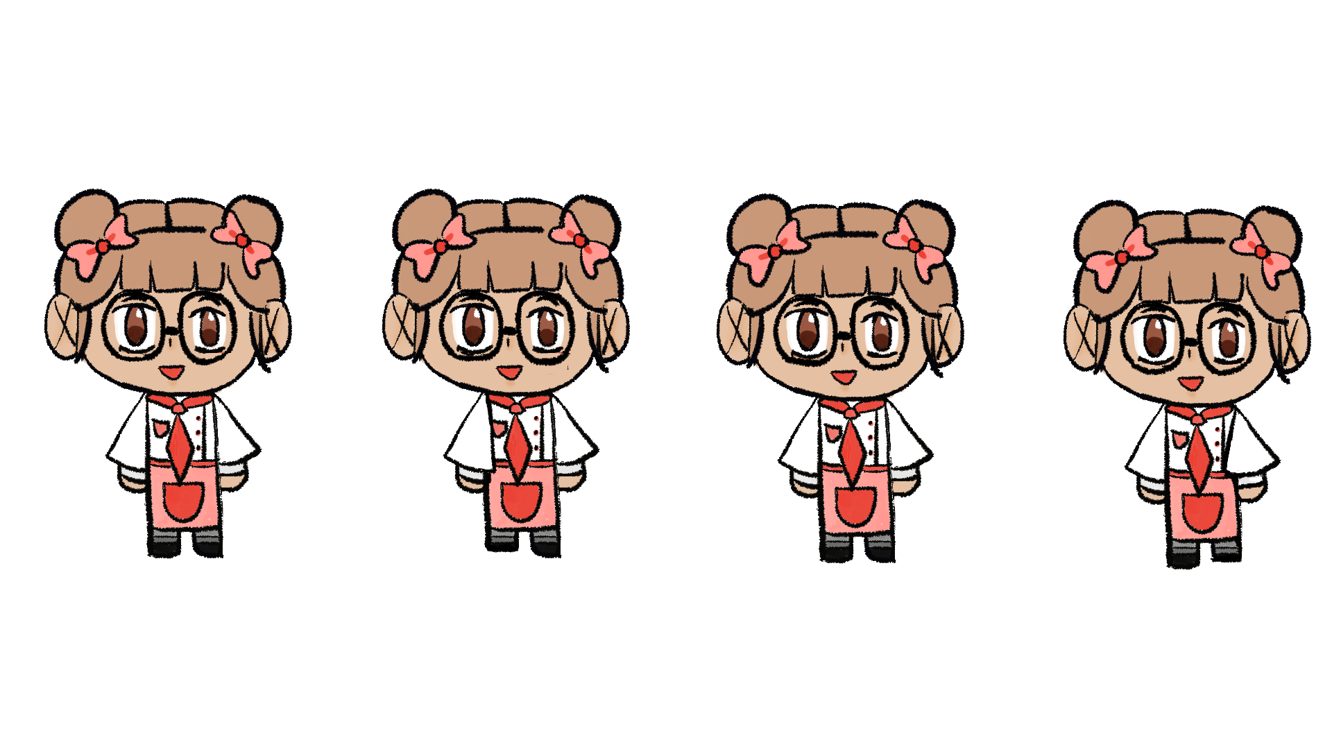
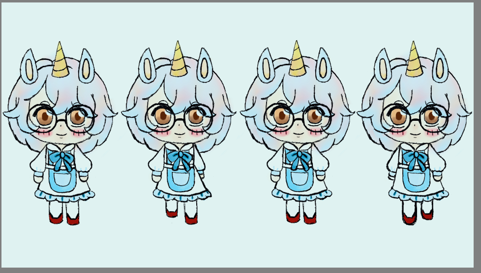
I wanted Whisker 2 to have characters that were more humanlike so I decided to make a human chef with unicorn features. I chose a unicorn specifically because they are one of my favorite animals and I thought it would be nice to be able to bring them into my game.
But when I added them into my levels, they stood out and not in a nice way. One of the big problems with the new character was that their dull, pastel color scheme didn't match with the vibrant environment. I received some feedback from my friends who also found that the color palette didn't work, but also they thought that the numerous hair strands were distracting.
I realized that the biggest reason for why this design failed was because I made it in a vacuum. It would have looked nice by itself, but it wasn't cohesive with the actual game it was for.
So I got to work, this time I used a more warm color palette that fit the vibe of Bakery much more. I would make a new design, but this time they were fully human and more vibrant. I made a third version after this mainly to reduce the darkness of the hair, but to also polish the design more. Even so, I really enjoyed being able to create my own assets.
I felt like it really allowed me to understand the more artistic aspects of game development and I hope to be able to make my own 3D models in the future too!
First Design
Second Version
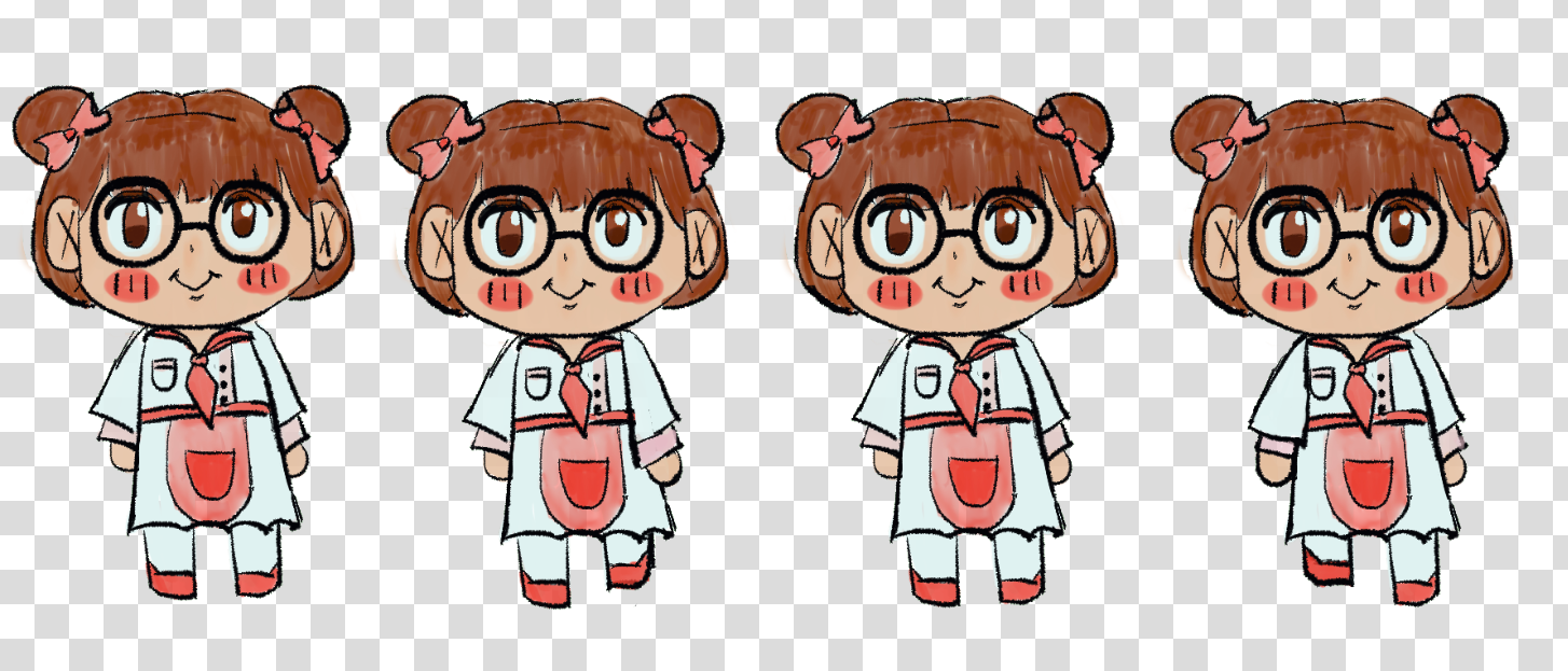
Final Design